
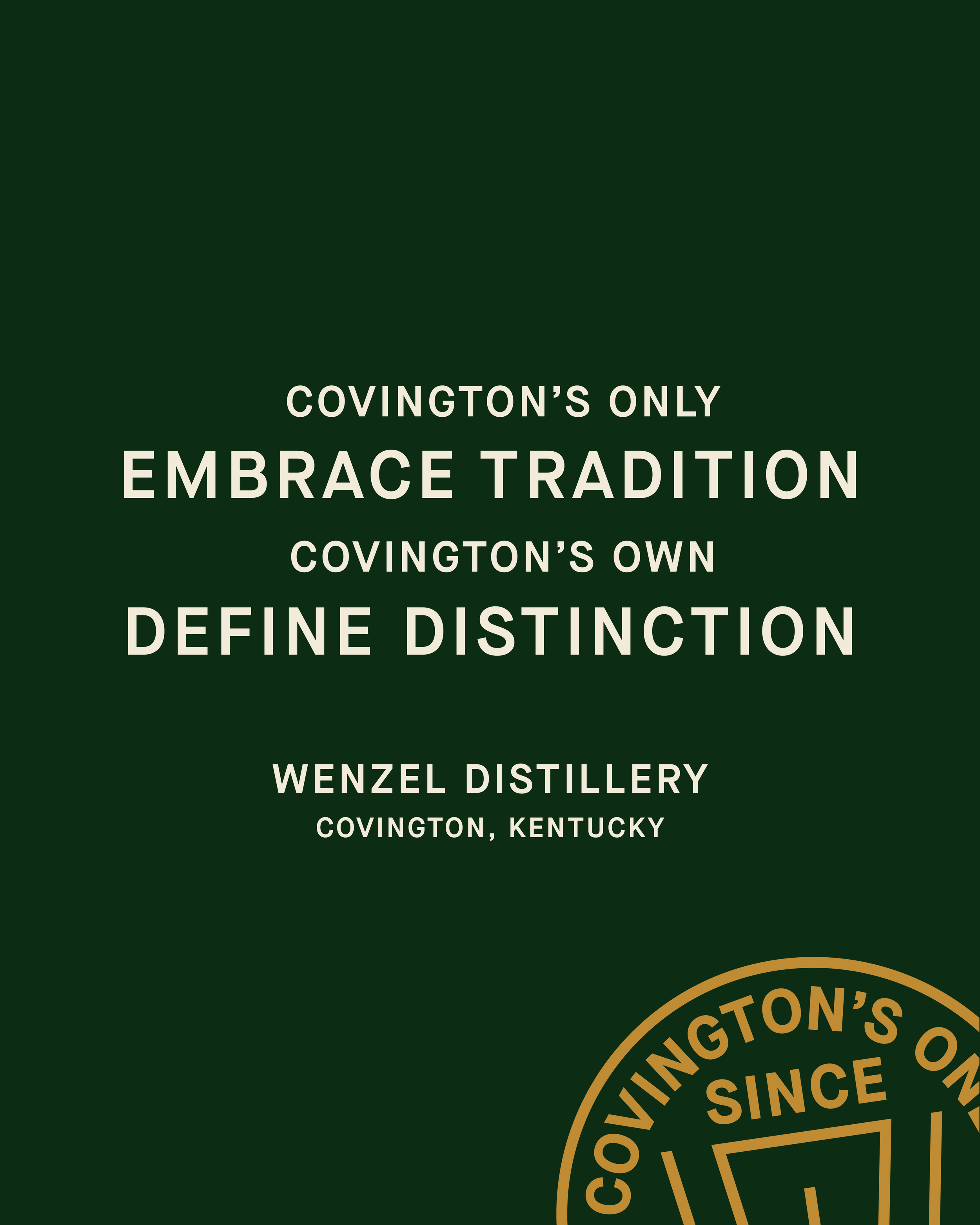
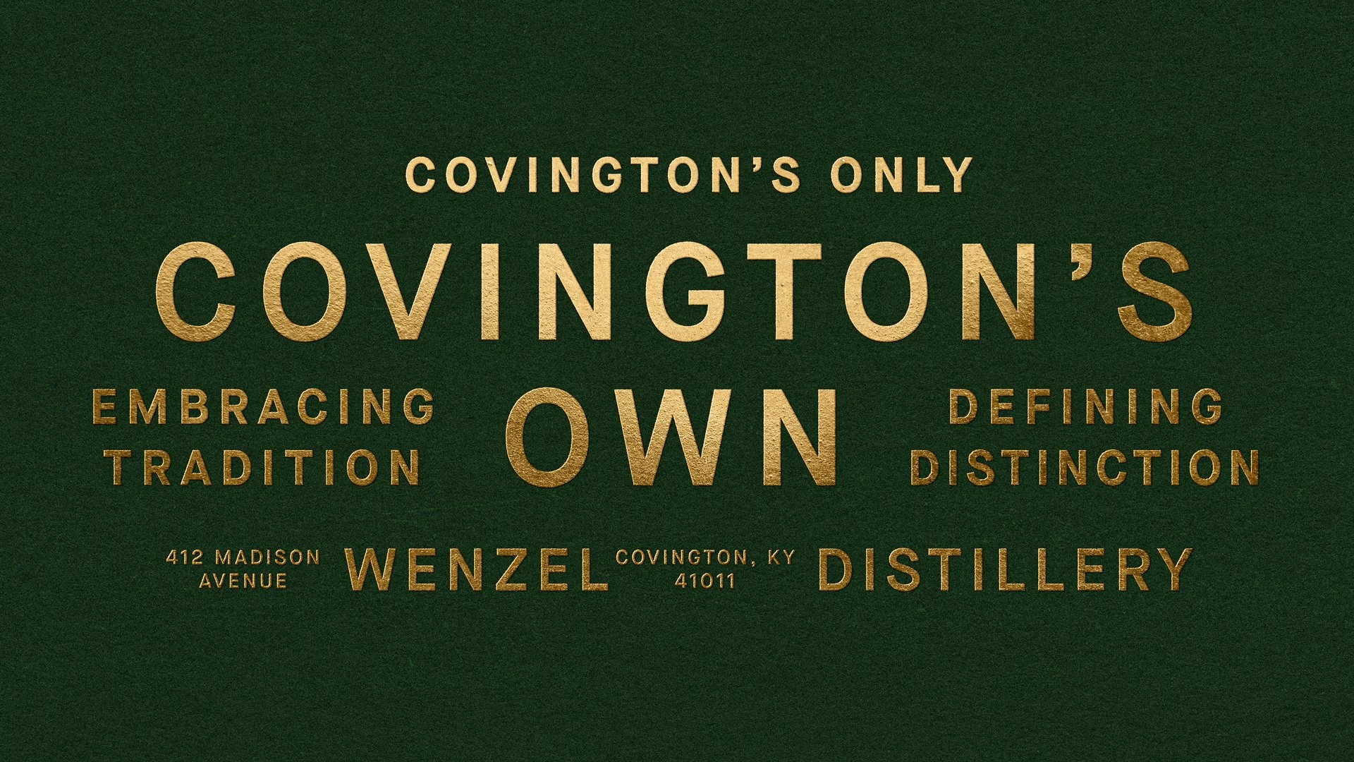
COVINGTON’S ONLY. COVINGTON’S OWN.
Wenzel Distillery
WHAT WE DID
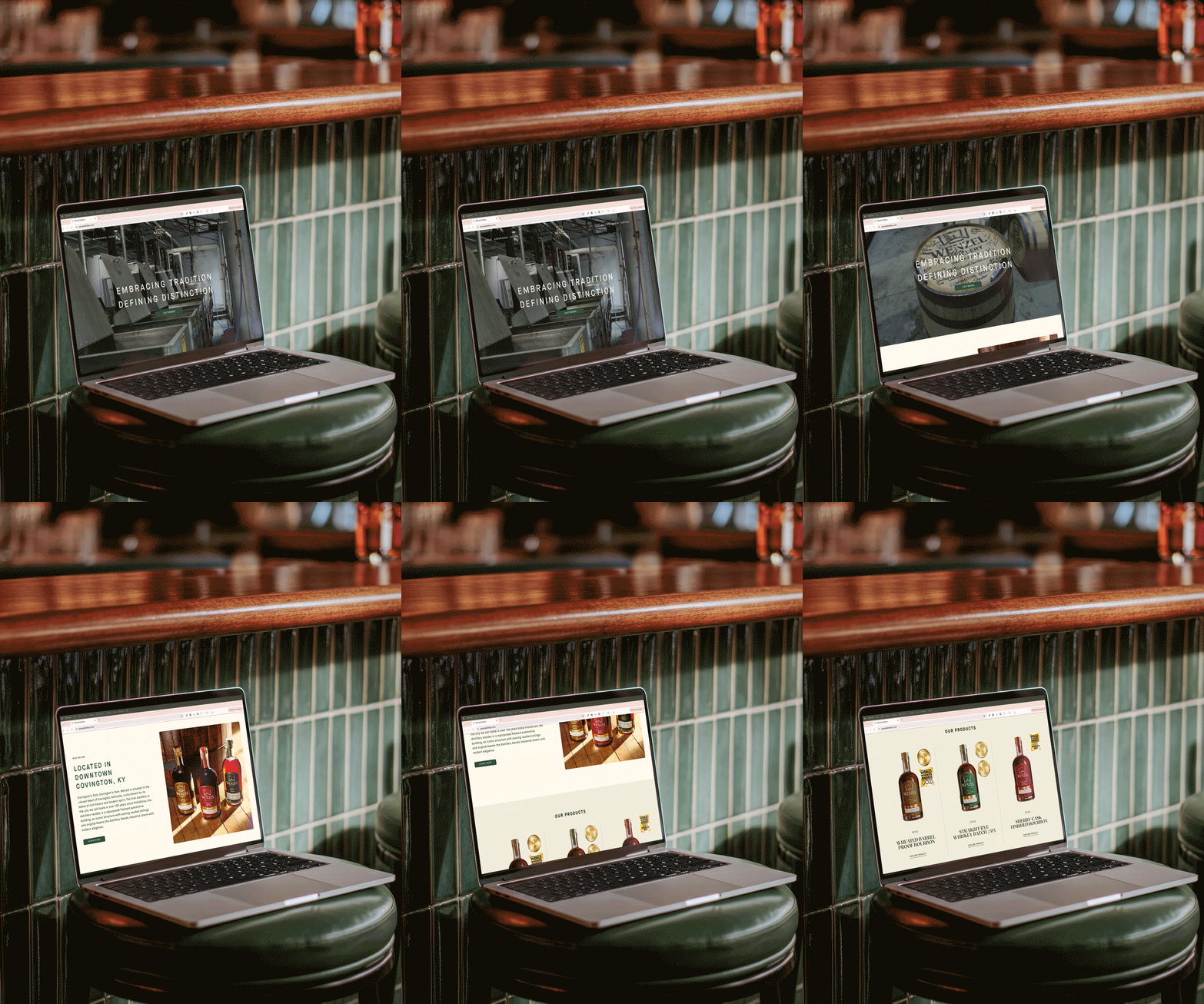
Brand Identity, Campaign, Copywriting, Merchandise, Packaging, Strategy & Positioning, Video, and Web
PHOTOGRAPHY BY
-
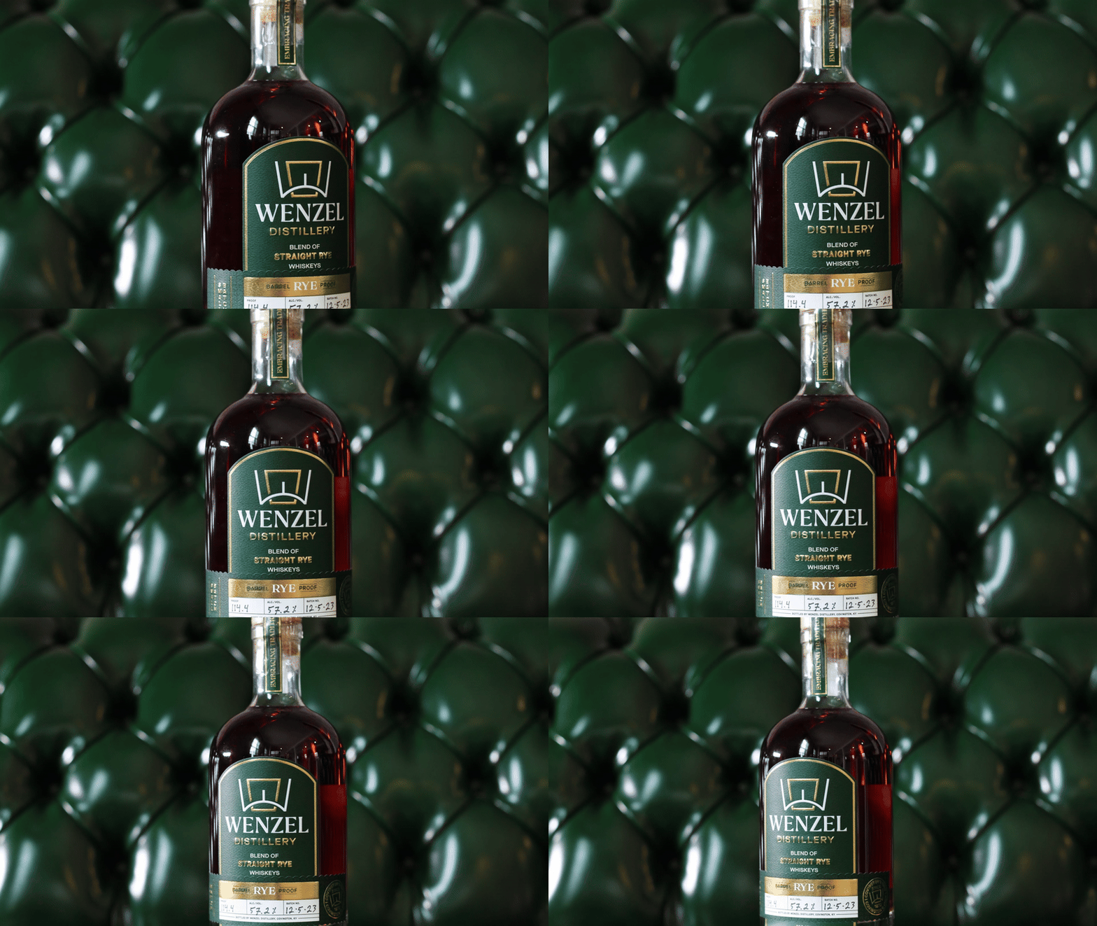
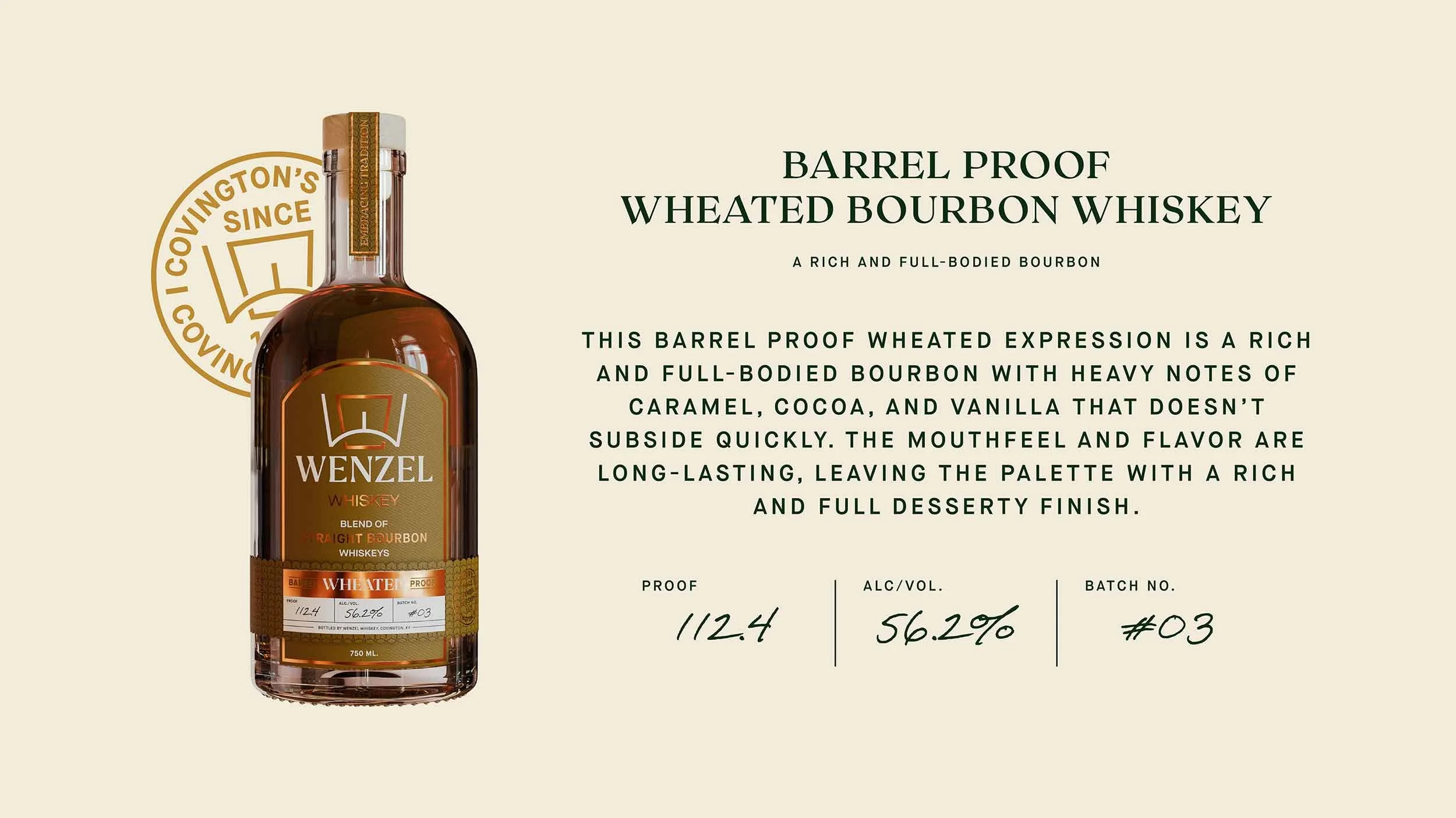
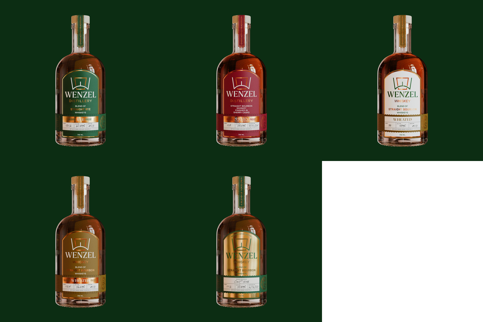
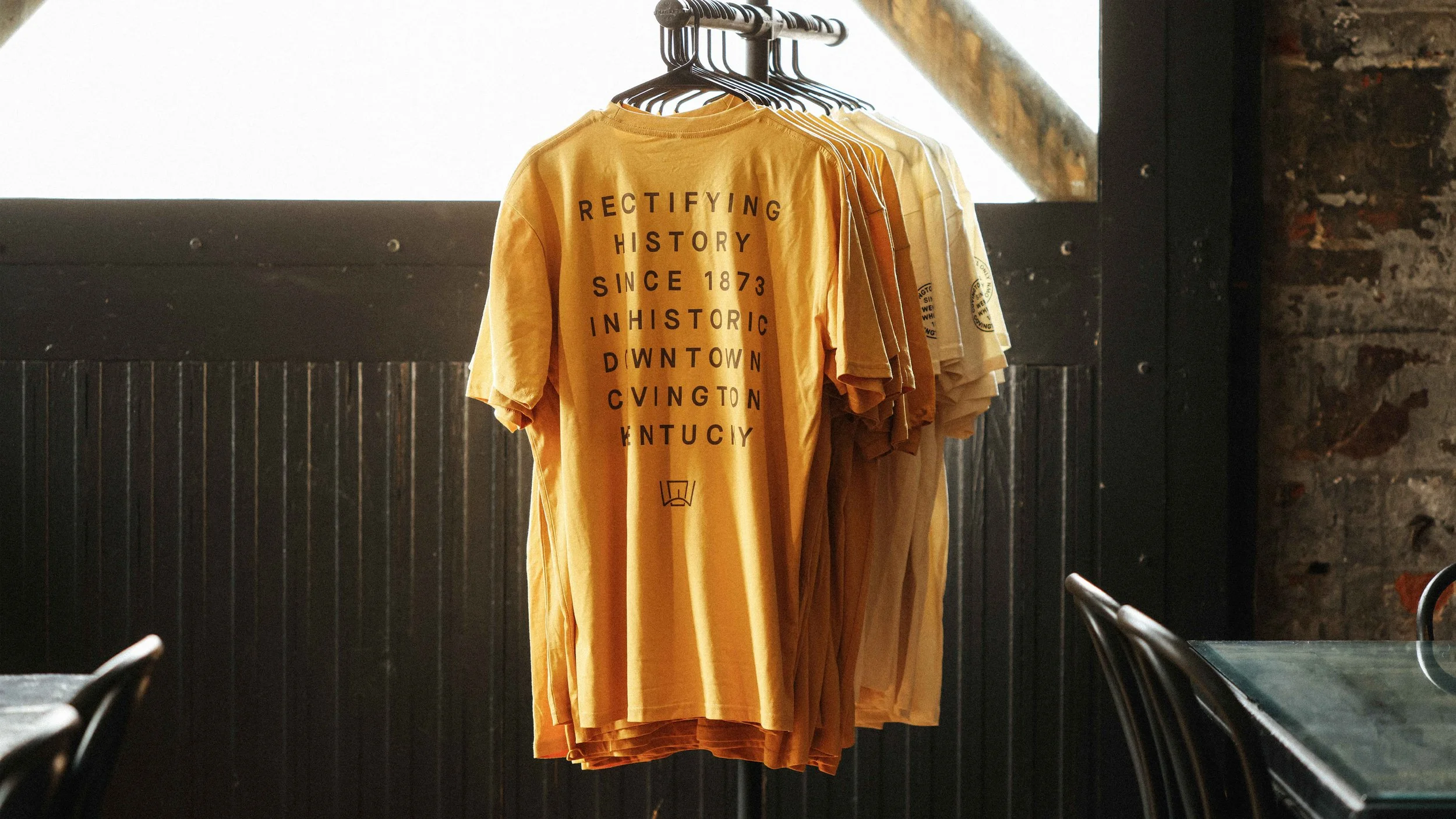
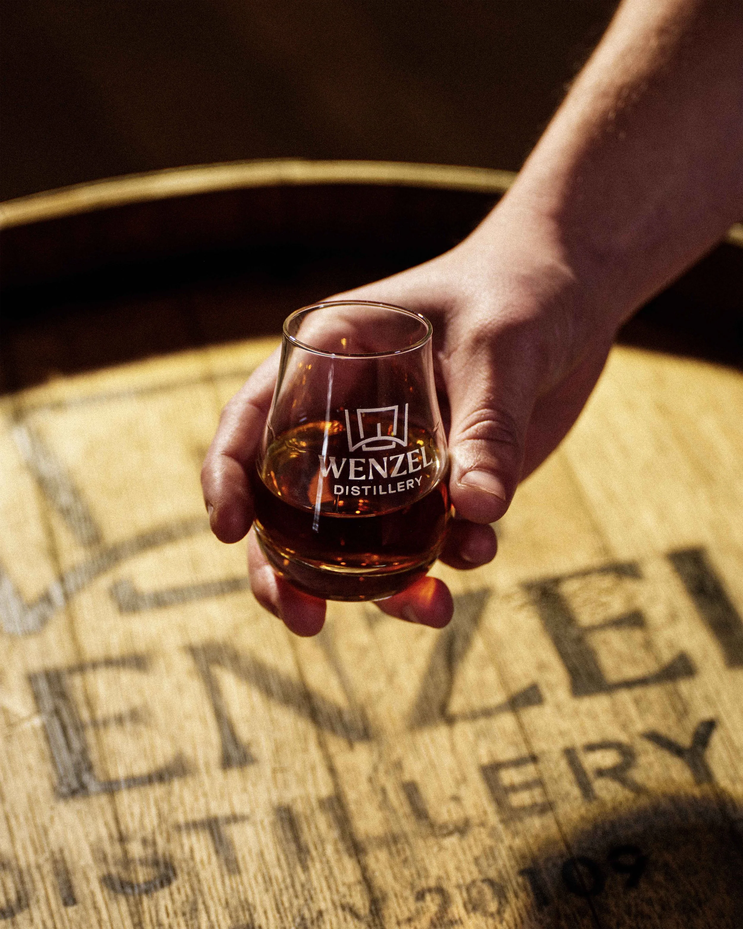
Wenzel Distillery is a craft bourbon whiskey destination located in Covington, Kentucky, rooted in the city’s distilling past and redefining its future. Housed in an 1873 building that once operated as a rectifier, Wenzel revives the forgotten art of whiskey blending through hands-on experiences. Alongside its signature experience, Wenzel produces a growing portfolio of house-made award-winning bourbons and spirits.
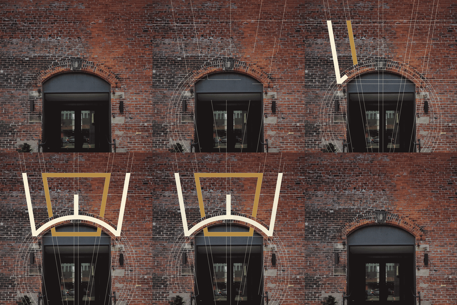
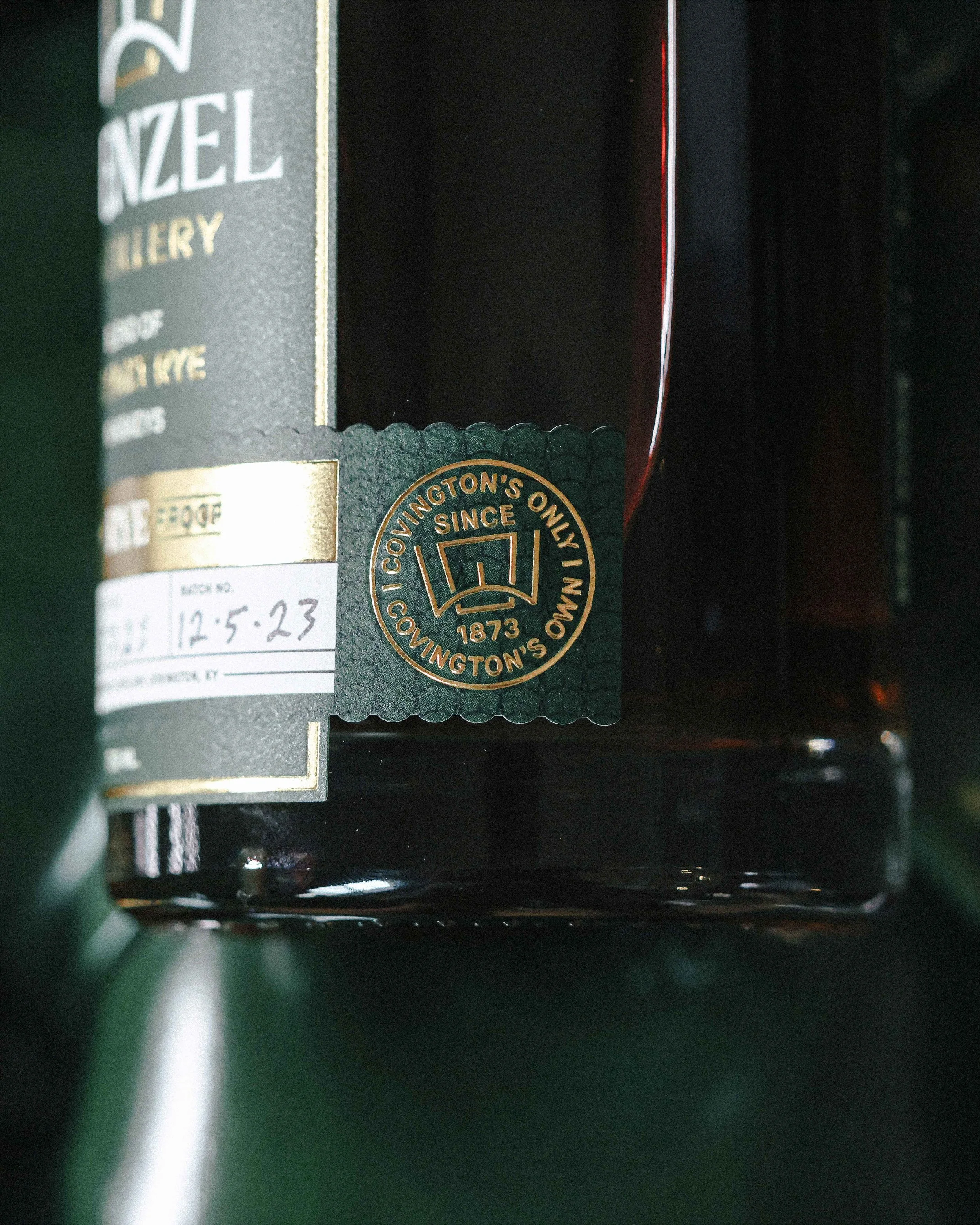
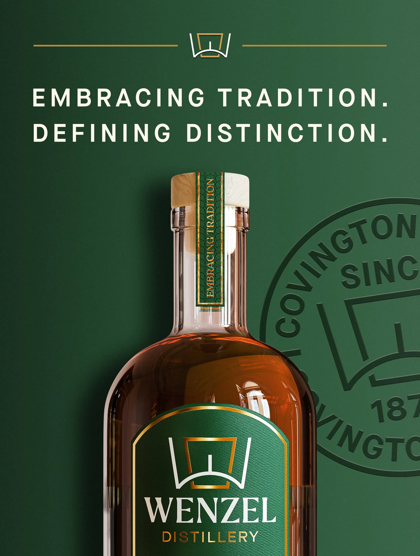
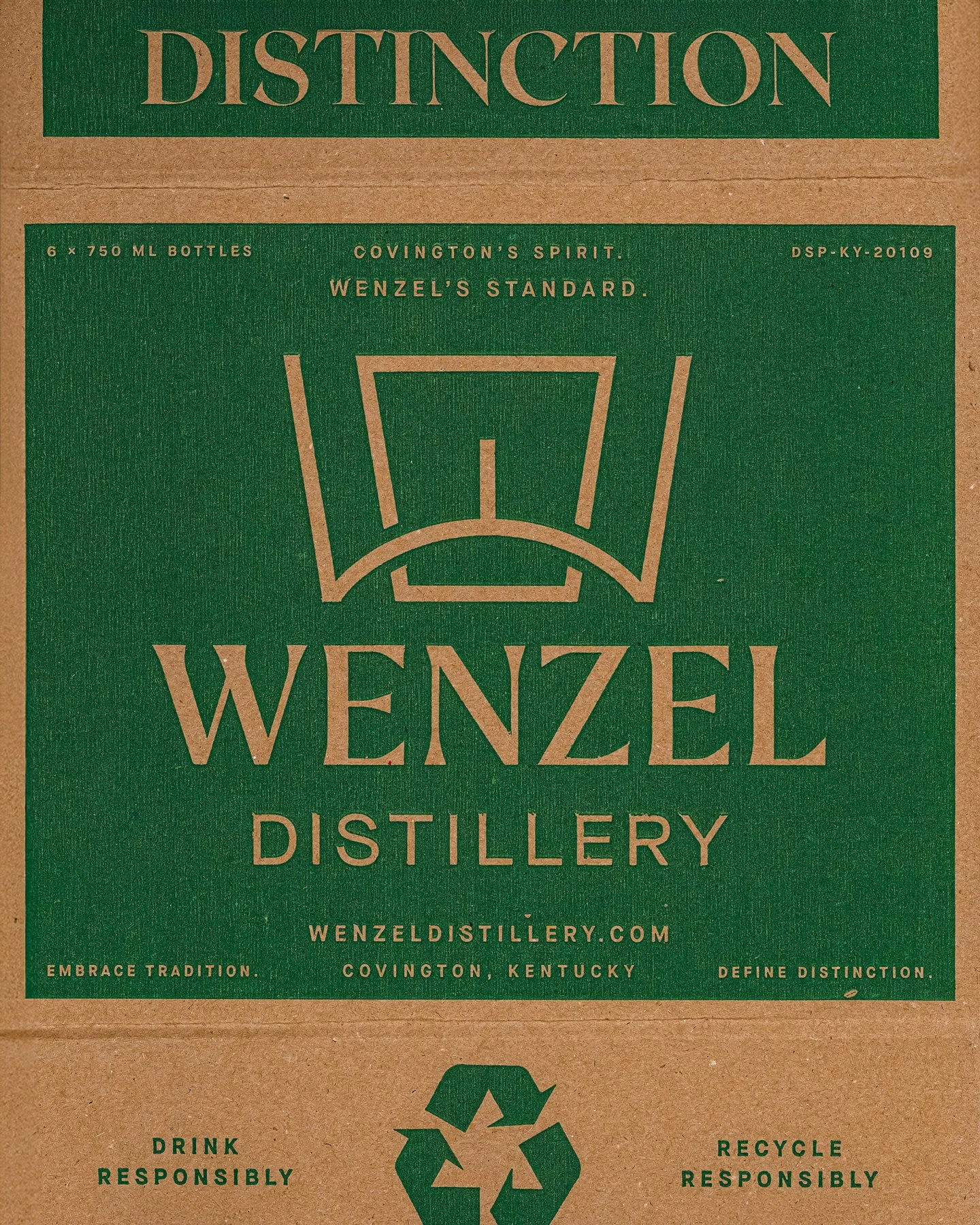
The studio developed every Wenzel brand asset from the brick up, drawing inspiration from the arched entry to the building’s history-rich blending room to create a brandmark that echoes both a keystone and a bourbon glass. The visual identity honors Wenzel’s 19th-century roots while boldly positioning it for a new generation of bourbon enthusiasts.


BUILT FROM THE BRICK
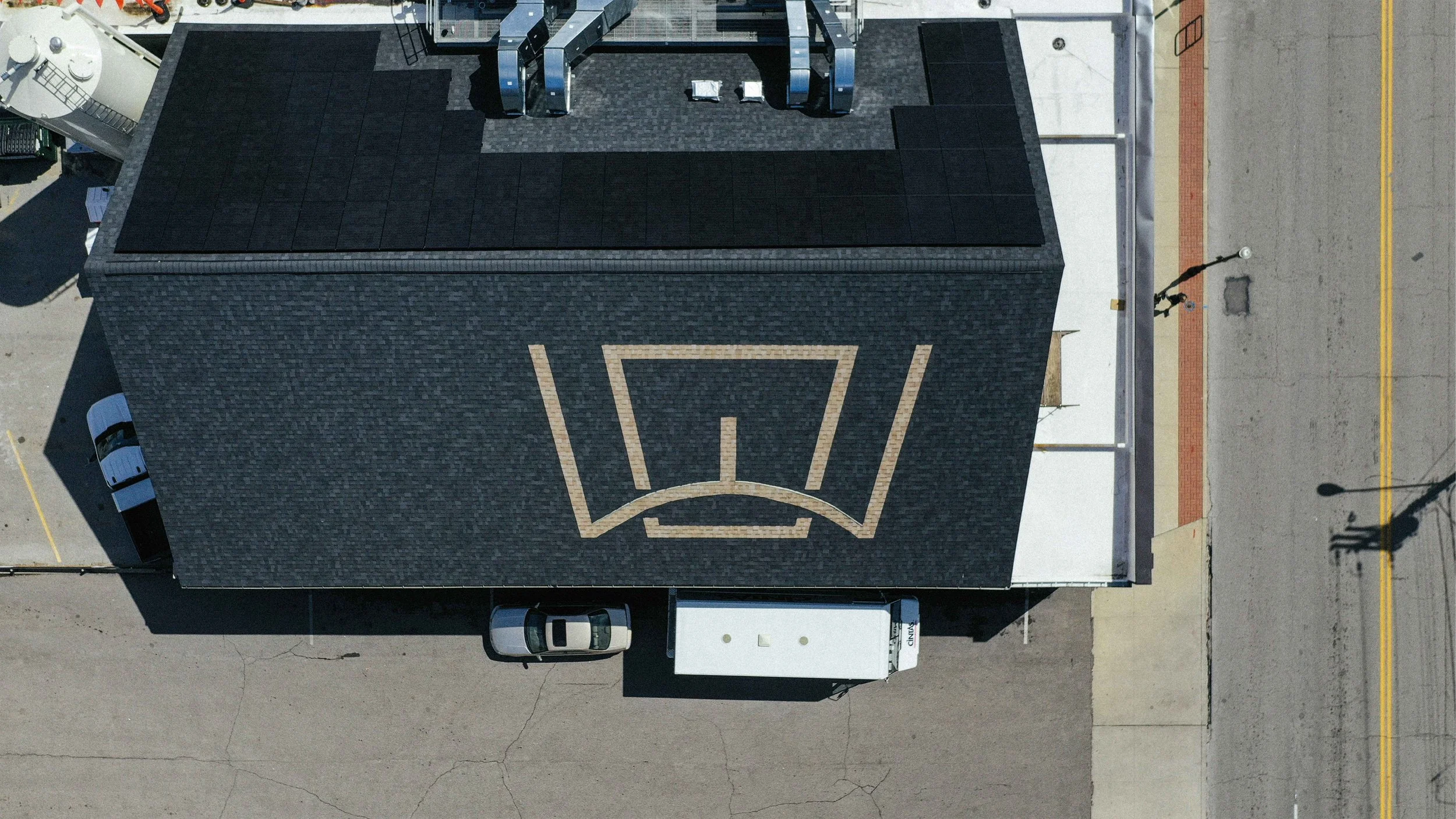
The Wenzel Whiskey logo draws from the distinctive brick archway that frames the entrance to the distillery’s 19th-century building. This architectural detail, once a functional keystone of the original rectifier, is now a mark that bridges past and present. By translating a physical element of the space into a core piece of visual identity, the logo grounds Wenzel’s brand in place and history with purpose.



PULL UP A CHAIR AND LET’S CHAT, SHALL WE?