
A NEW KIND OF REFINED
Coterie Senior Living
WHAT WE DID
Brand Identity, Collateral Deployment, Copywriting, Packaging, Art Direction, and Strategy & Positioning
PHOTOGRAPHY BY
ILLUSTRATION BY
-
Coterie Senior Living is a new kind of refined — offering discrete care, an active intellectual and social life, and anticipatory, world-class service for distinguished older adults.
As a new generation reached retirement and senior citizenship, there existed no options for influential, urban-dwelling older adults seeking a luxury senior living environment. With the desire and resources to fill this gap, Coterie approached the studio looking for a brand that would engage, invite, accommodate their growing affluent consumer.
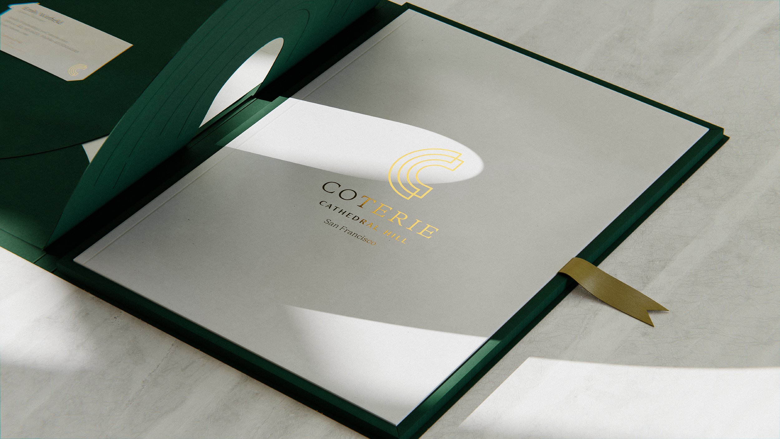
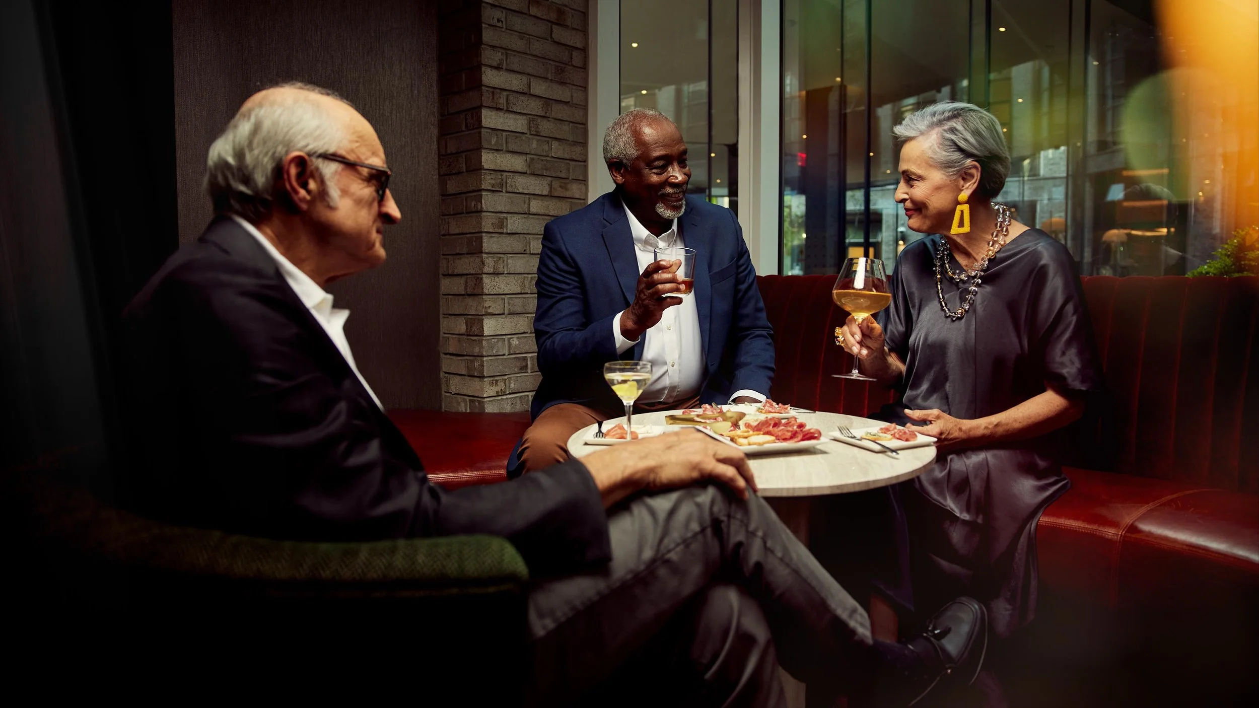
The studio began with brand pillars that would speak to their sophisticated clientele: elegance, community, and influence. We built every aspect of brand development, from strategy and positioning, branding and iconography, to architectural considerations around the story of discrete care, an active intellectual and social life, and anticipatory, world-class service. When the time came to launch this disruptive brand, we used energetic photography and dark, sophisticated, gold-foiled collateral to tell this story to the most distinguished older adults and those who care for them.


LOGO
We developed a typographic stack system for Coterie’s logo needs. Outside of it’s primary logo, neighborhoods and cities needed to be represented in their own unique logo lockups with room for future locations to be included.


ICONOGRAPHY
The semi-circular nature of the Coterie ‘C’ offered design considerations when it came to developing an icon system for the hospitality brand. From cities to concierge, each icon is built with the brands elegant line language in mind..


PATTERN
Inspired by the art deco-inspired approach Coterie’s visual language, we developed a set of patterns designed to live harmoniously within the space it’s placed in. Whether carefully repeated on a wall, softly frosted on a window, or wrapped in gold foil on their welcome kits, Coterie’s patterns extend the intent to establish a new kind of refined.


PHOTOGRAPHY
Alongside Aaron Conway, Durham art directed, styled, cast and shot the brand photography for Coterie Senior Living.


PULL UP A CHAIR AND LET’S CHAT, SHALL WE?