WHERE TIME & TASTE RUN DEEP
Columbia Creek Tennessee Whiskey

WHAT WE DID
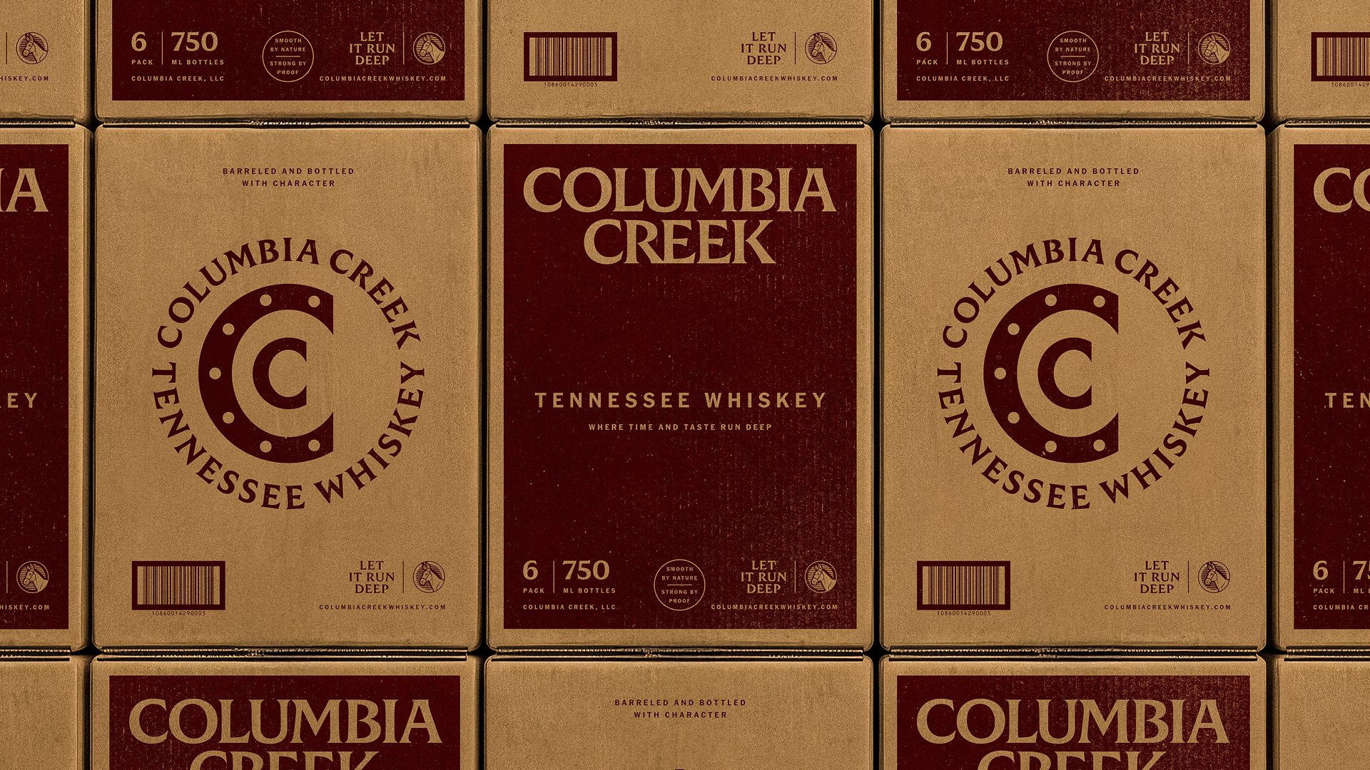
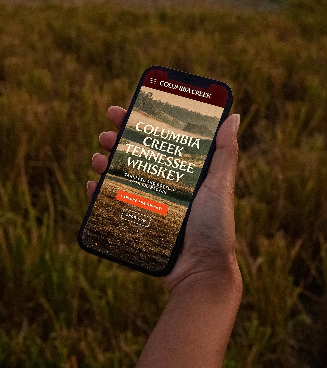
Art Direction, Brand Identity, Copywriting, Packaging, and Web
-
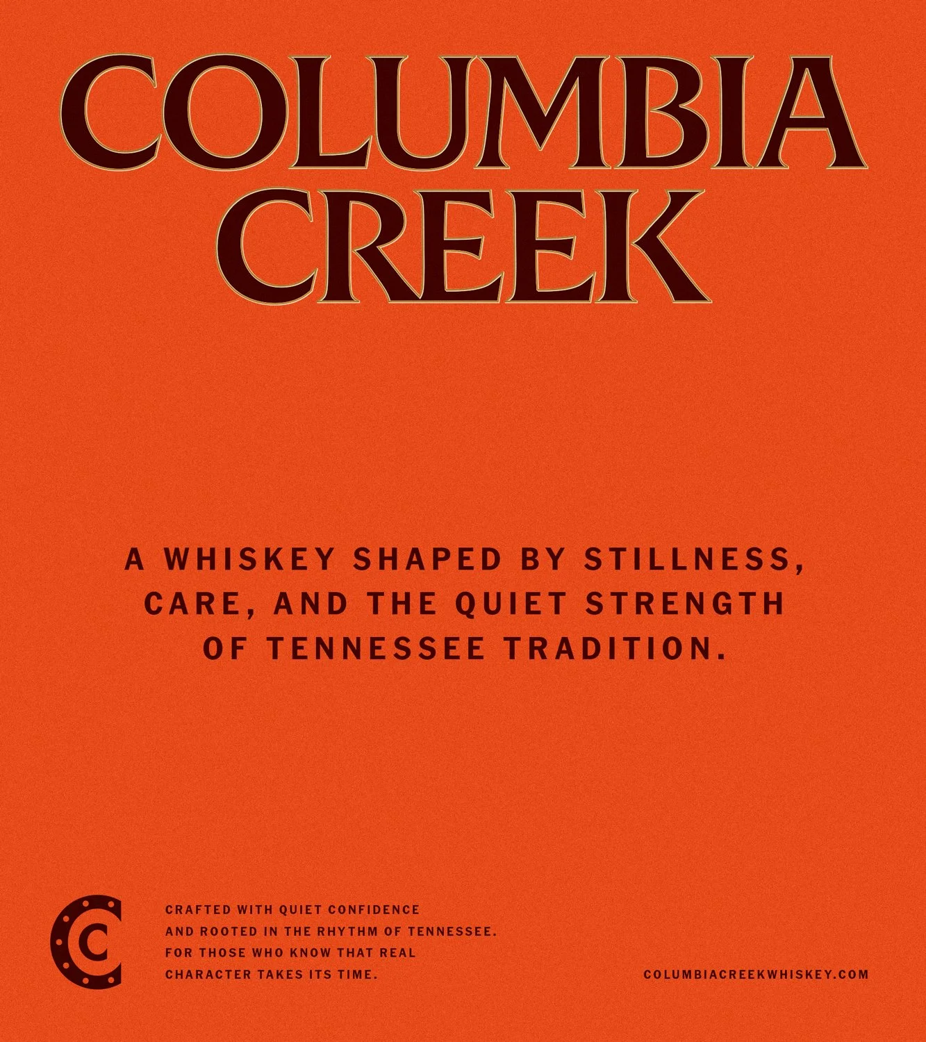
Columbia Creek Tennessee Whiskey honors the kind of spirit you don’t rush. Built in the heart of mule country, it carries the quiet confidence of work done right and traditions carried forward with intention. Durham partnered with Columbia Creek to build a brand shaped by place, patience, and the steady character of Tennessee craft.
This whiskey didn’t need theatrics. It had Columbia, Tennessee. A town that gathers each spring for Mule Day, celebrating the animal that drove real work and real progress. The mule made sense from the start. Resilient, patient, and stubborn in all the right ways. This Tennessee tradition gave us our way in.
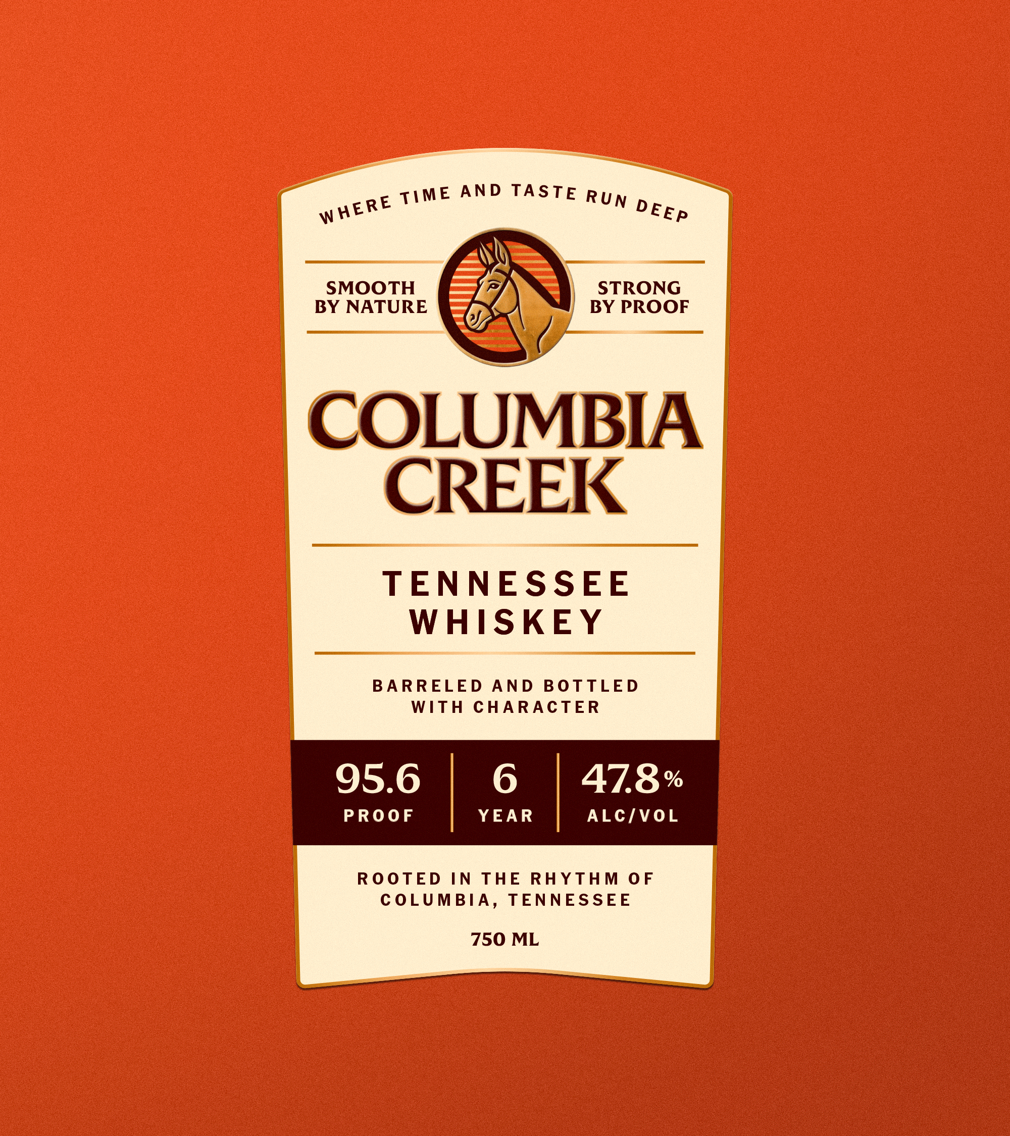
With this story and heritage in mind, Durham developed the full brand identity and packaging system, along with art direction and web design. The visual language draws from Tennessee’s charm and quiet confidence. Warm maroon and gold tones, honest imagery, and typography rooted in classic craft set a tone of authenticity and pride. Every detail and design decision nods to a craftsmanship that values effort over ego.
Let It Run Deep.


THE MULE AS A SYMBOL
Columbia, Tennessee honors the mule in a way that isn’t nostalgic, but earned. Since the 1840s, they’ve gathered each spring for Mule Day, celebrating the animal that pulled the weight of real work and real progress. Resilient, patient, and stubborn in the ways that matter most.
We didn’t choose the mule because it looks good (although he’s a handsome fella if you ask us).
We chose it because of the quiet strength it represents. Grit without noise. Craft that puts
effort ahead of ego. The kind of spirit you don’t
just admire, but build around.
For Columbia Creek, the mule isn’t decoration. It’s a reminder of where true Tennessee character comes from and the care they pour into every drop.


PULL UP A CHAIR AND LET’S CHAT, SHALL WE?